Software Design
Guest Profiles
The Problem
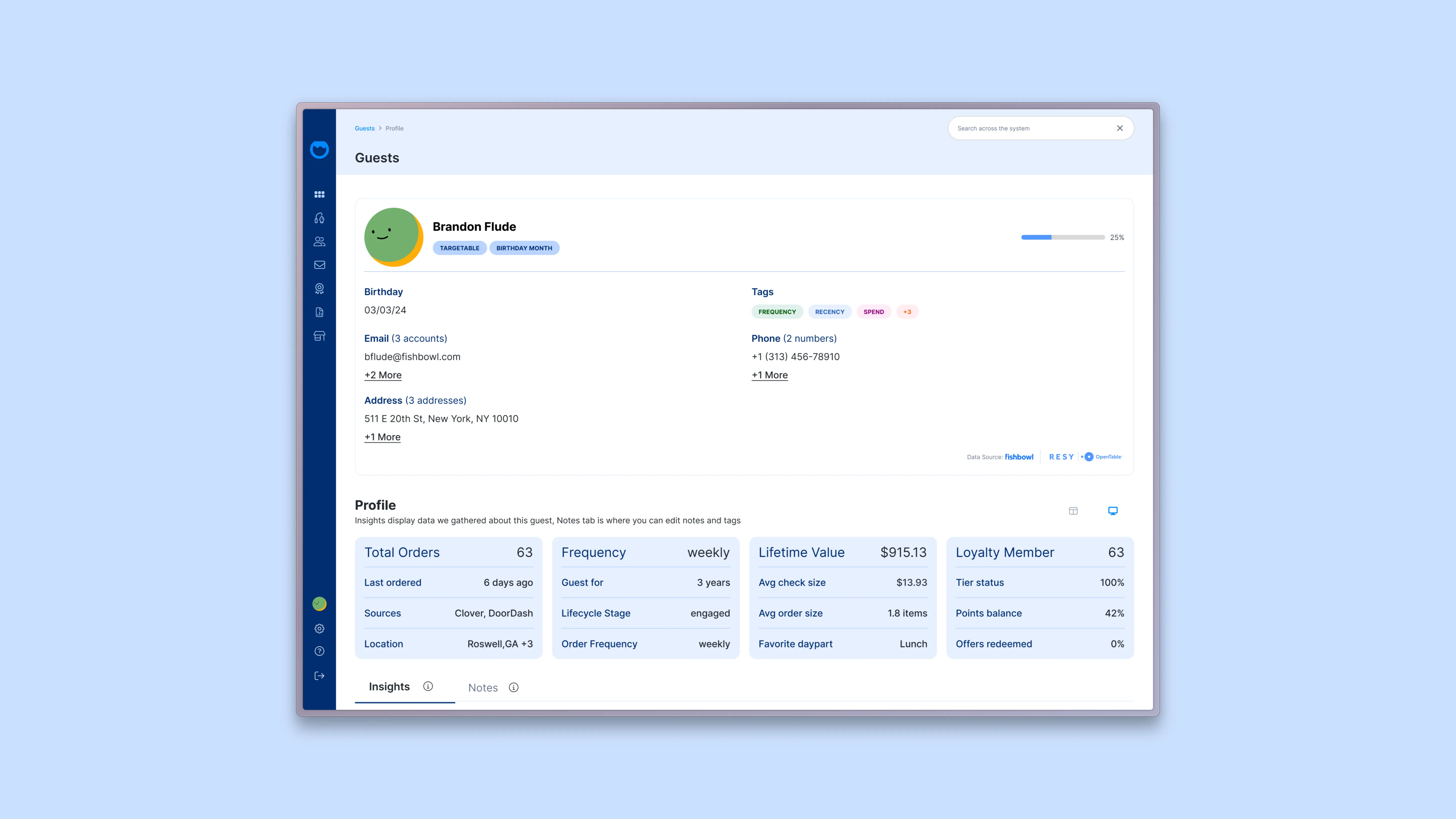
The Guest Profile screen was one of the most overwhelming surfaces in Fishbowl. Every dimension of a guest — contact info, birthday, memberships, preferences, recent visits, campaigns received, reviews left, wifi sessions — lived as a card on the same screen at the same visual weight. To understand who a guest was, an operator had to scan six cards across two rows and assemble them mentally.
That assembly was the real cost. The data was all there. What was missing was a story. A restaurant operator looking at a regular shouldn't have to think "they ate twice last week, spent $40, came on a Wednesday, used the wifi for two hours, and gave us four stars" — they should be able to see what kind of guest this is at a glance, and then drill into the dimensions that matter.

What I Built
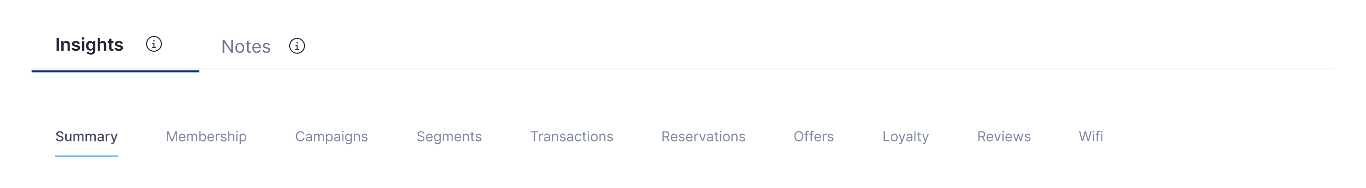
A redesigned Guest Profile organized around a different unit. Instead of one screen with six static cards, the profile became nine purpose-built views of the same guest — Summary, Membership, Campaigns, Segments, Transactions, Reservations, Offers, Loyalty, Reviews, and Wi-Fi — each tuned to a different question an operator might be asking.
All nine views share the same hero, so the guest's identity stays consistent across the system. What changes between tabs is what dimension of that guest you're examining. Same person, nine windows.
As the sole designer on the redesign, I owned every screen end to end — hero, metric cards, tab system, per-view layouts, and the Summary tab as the centerpiece.
A Hero That Stays Constant
Every view shares the same top section: photo, name, contact attributes, and the bright pill-shaped tags that flag what matters most about this guest at a glance — Targetable, Birthday Month, MVG, Influencer, Special Relationship, Accessibility.
Below the pills sit four metric cards that anchor the whole system: Total Orders. Frequency. Lifetime Value. Loyalty Member. These are the four numbers an operator wants to see before they pick which tab to dive into. Bright, weighted typography. No interpretation needed.
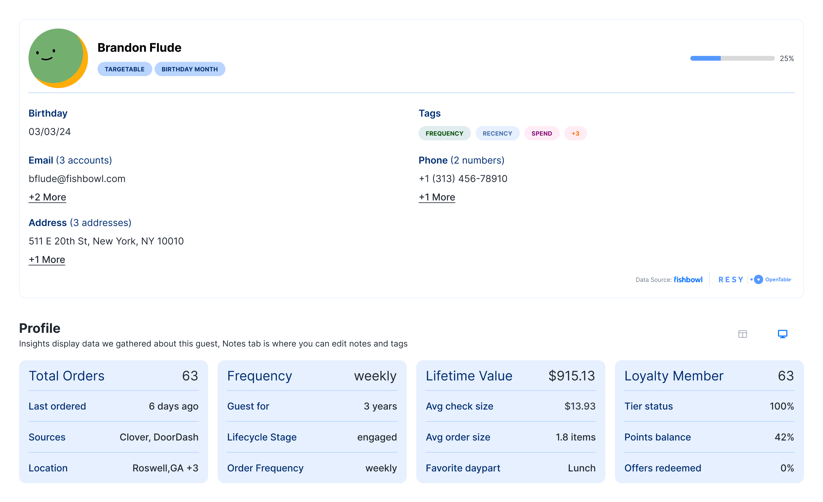
The hero is the answer to "who is this guest, broadly." The tabs below answer everything else.
Nine Views, One Person
Each tab is its own composed screen, not a generic data table. The architecture is the same across the system — hero stays, metric cards adapt to the tab, then a dimension-specific deep view below — but the content of each view is purpose-built for the question being asked.
Membership surfaces the guest's loyalty status, tier, and program engagement.
Campaigns shows what marketing has been sent to this guest, when, through which channel, and whether they engaged.
Segments shows which behavioral groups the guest belongs to, and how those segments are defined.
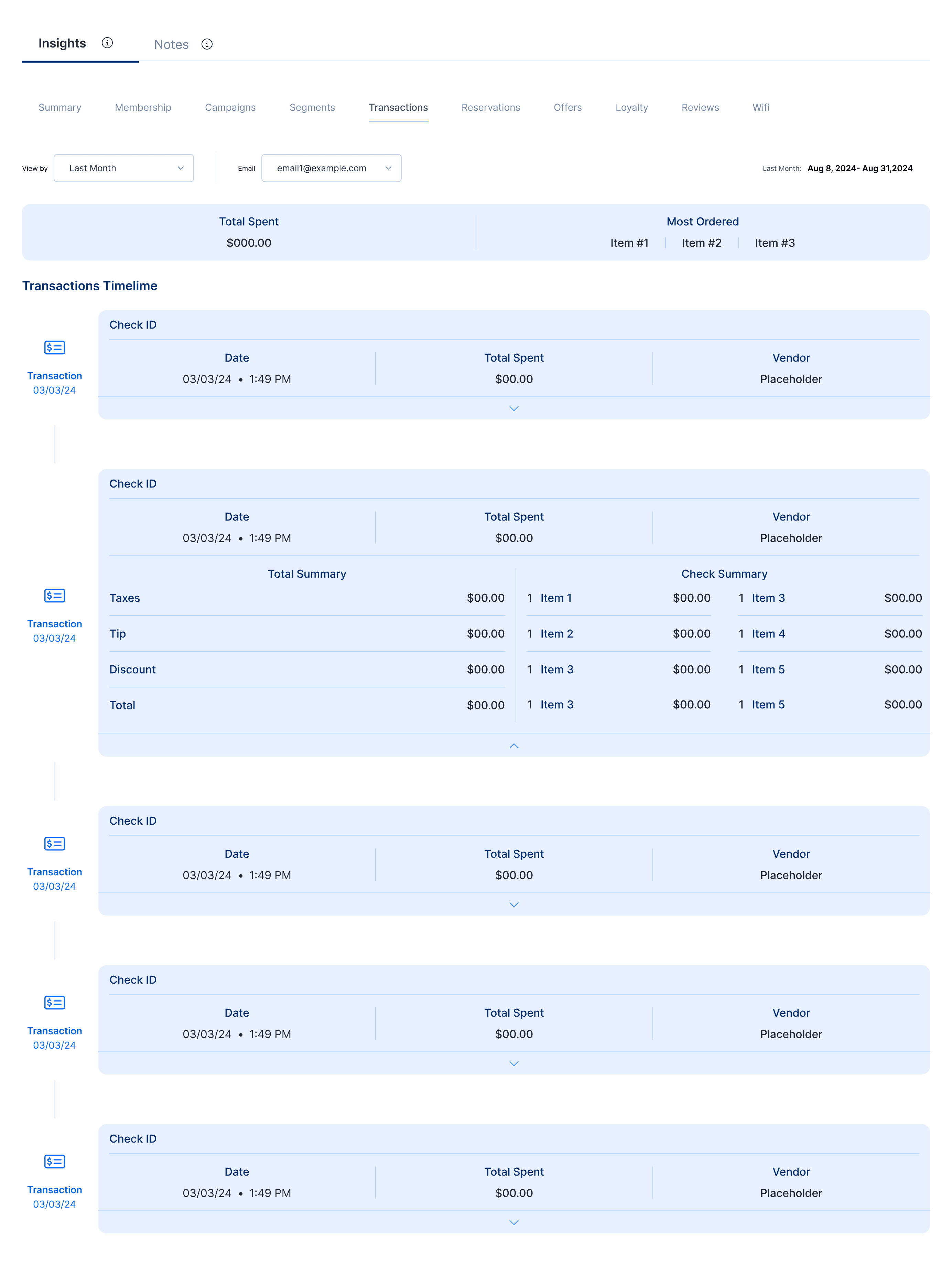
Transactions shows the actual financial relationship — orders, spend, frequency over time.
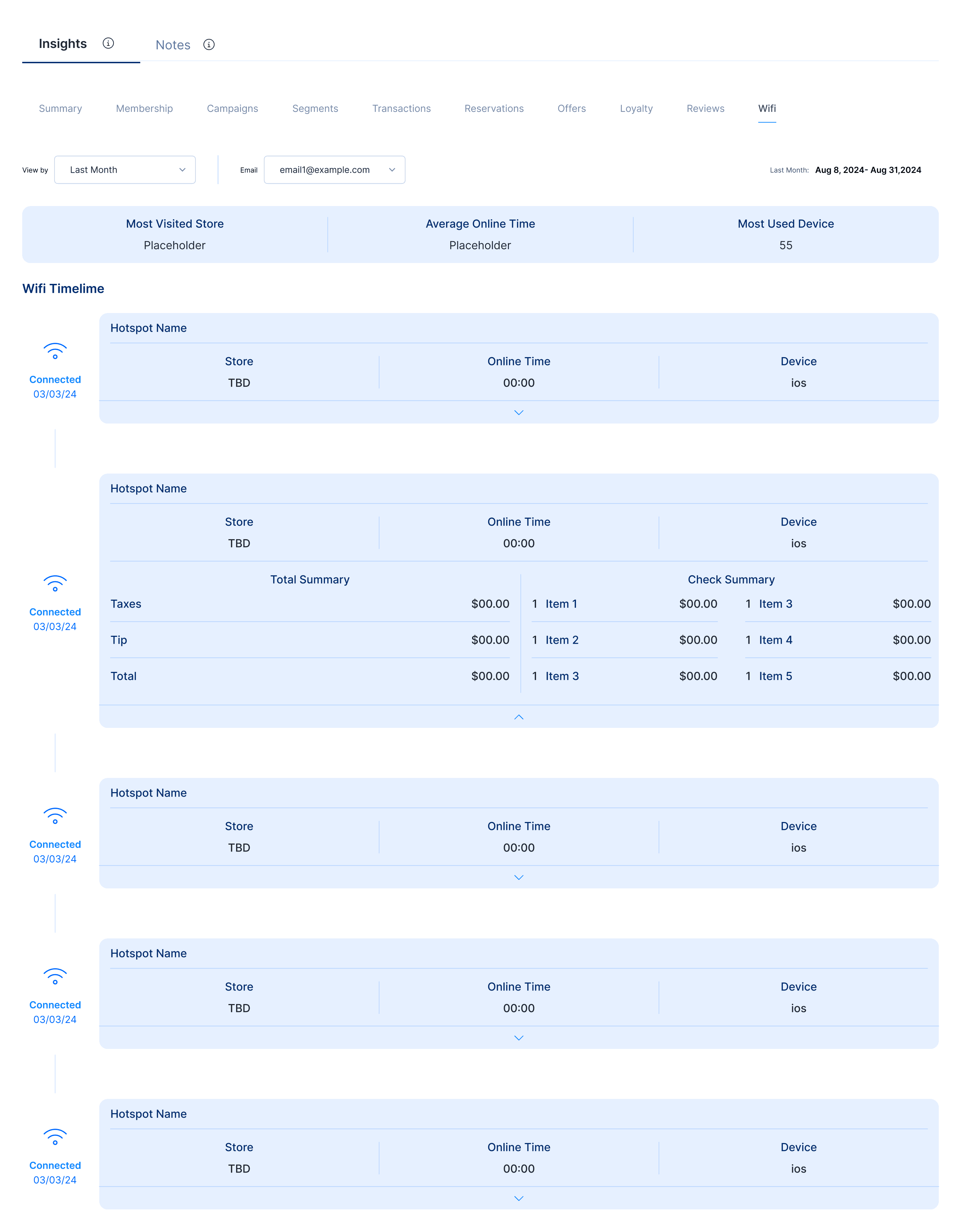
Reservations, Offers, Loyalty, Reviews, and Wi-Fi each have their own dedicated views with the right metrics and tables for that dimension.


The system flexes because the data underneath flexes. The hero gives the operator stable ground; the tabs let them dig wherever the question takes them.
The Summary Tab
The most distinctive view in the system, and the one the whole redesign was built around, is the Summary tab.
Summary doesn't ask the operator to look at data. It asks them to look at a story. Each visit a guest has ever made becomes one entry in a vertical timeline — and each entry pulls in everything that happened around that visit: what they ordered, how they paid, which loyalty tier they were in, what offer they redeemed, which campaign brought them in, whether they used wifi, whether they left a review.

The point isn't the individual data. The point is that an operator scrolling the Summary tab sees patterns the dashboard never could surface: this guest always comes on Wednesdays. This guest spends more when they come with a friend. This guest only redeems offers in the evening. This guest stopped coming after that bad review. The view is closer to a personal narrative than a customer record.
A Familiar System for a New Problem
Fishbowl's broader dashboard work — the modular widget system I designed for the main analytics surface — gave this redesign a head start. The same principle of a flexible system that adapts to the question being asked applied here, just at a smaller unit. The Dashboard flexes across different operators with different jobs; the Guest Profile flexes across different questions about the same person.
The reusable pieces — pill tags, metric cards, consistent table treatments — carried directly from the Dashboard system into the Guest Profile, which kept the redesign consistent with the rest of the product and made development substantially faster than building it from scratch.
My Role
Role
Sole product designer
Team
PM, engineering partner, data team
Direction
Internal stakeholders (Customer Success, PM, operations) identified the screen as a pain point; design and architectural decisions owned by me
Scope
Full redesign — hero, tab system, nine per-view layouts, Summary tab timeline, component reuse from existing Fishbowl design system
Platform
Web (desktop)
Tools
Figma
Outcome
The redesigned Guest Profile shipped and is in active use across Fishbowl's customer base. It serves as the per-guest view for restaurant operators across the 50,000+ locations Fishbowl supports.
Reflection
The Guest Profile redesign taught me to question what unit a screen is built around. The original Profile was built around categories of data — contact, celebrate, insights, preferences, memberships. Each category got a card and the operator did the work of assembling them into a person.
The redesign reorganized around questions. What do I want to know about this guest right now? The answer determines which tab opens, and each tab is built for that answer specifically. The data didn't change — the organizing principle did.
The lesson generalizes. When a screen feels overwhelming, the problem is usually not the volume of data — it's that the screen is organized around the data instead of around the user's question. The fix isn't fewer fields. The fix is asking what question this screen is supposed to answer, then building that screen for that question, and giving any other question its own door.